Cannacopia
UX Research | Wireframes | Prototype | Web Design

Cannacopia is a mobile application that let users find which cannabis strains will help them feel the way they want, based on their desired mental mood, physical effect, medical condition, and taste preference.
There are over 7,500 different kinds of cannabis strains, and each one has a different terpene profile which affects the body and mind differently.
I joined the Cannacopia team to redesign a new version that would include new features and would better relate to today's cannabis consumption habits.
The new version which I designed is currently under development.
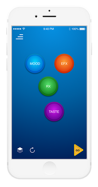
THE OLD VERSION
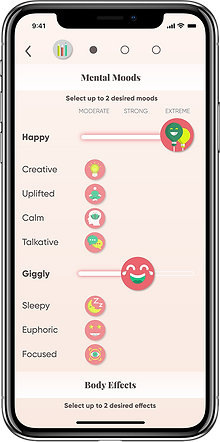
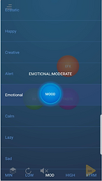
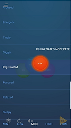
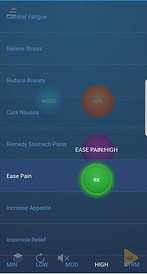
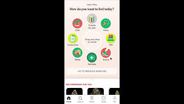
The old version’s interface was based on four attributes users can select and adjust: Mood, Effects, Rx (and Taste.
By tapping on one of the four buttons, users can select their desired attribute by dragging the button on the X-axis and adjust the attribute’s intensity (from low to max) by dragging it on the Y-axis.
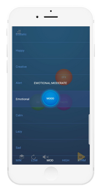
This interface, however unique, caused a fair amount of confusion among users. When I observed users interacting with the app, I noticed that they were gazing at the screen in utter bewilderment.
After a prolonged silence, they began to ask "What do I do?", "Where do I need to tap?" "I don't understand this…"
Even though a demonstration video was created for users, most of them did not take the time to watch it. Therefore, I find it more effective to create an appealing intuitive interaction, that would require no explanation.
I identified several problems that caused this confusion:
-
The interaction of dragging the circled buttons along the X and Y axes does not follow current mobile design conventions, and users are largely unfamiliar with it.
-
Users do not experience a reasonable flow of orders of action.
-
Some users experience difficulties with understanding the terminologies of Mood, EFX, RX, and the differences between them.
-
Design and style were not up to date, incorporating unfamiliar icons.
-
Circled buttons at times overlapped one another and obstructed content.
-
The structure of the screen does not correspond to the natural eye gaze direction.
THE NEW VERSION
THE DESIGN PROCCESS
CANNABIS RESEARCH
It was clear to me that the users’ experience from the app’s design must become easier, more approachable, and more intuitive. But preliminary research of the cannabis industry was required, in order to better assess the wishes and needs of my users.
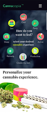
When users open the Cannacopia app, they are supposed to make decisions based on how they want to feel. I, therefore, asked myself:
How do cannabis consumers want to feel?
Why do they consume cannabis in the first place?
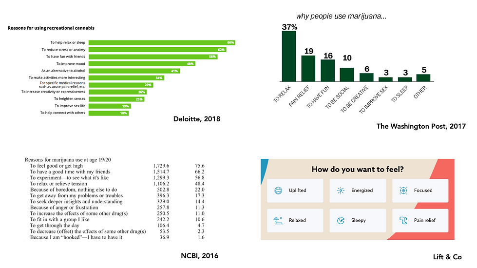
I found more answers to these questions when I interviewed budtenders (bartenders in cannabis dispensaries) and asked them:
What are cannabis consumers looking for when they purchase cannabis products? They replied:
"Something to help me sleep"
"Good stuff for a party"
"Cannabis for pain relief"
"High THC" or " CBD only"
The research yielded that these data constituted the main reasons for the popular consumption of cannabis, and they were precisely what I sought to underline in my designing of the users’ experience.
NEW INFORMATION ARCHITECTURE
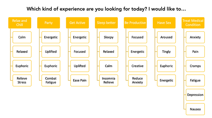
I created a new Information Architecture by taking the attributes listed in the Canncopia app and rearranging them into groups, following the top reasons for cannabis consumption.
I assumed it would be easier for cannabis consumers to select a certain experience relating to their consumption, rather than choosing one Mood, one effect, and one RX.
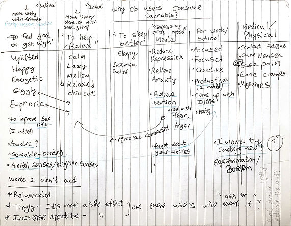
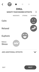
Inspecting the variety of possible effects available in the previous/older version, I noticed some effects may be regarded as identical to others (calm=relaxed, happy=uplifted) and also added some effects that were missing.
Working together with cannabis experts in my team, I created the following diagram:
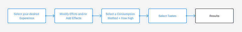
USER FLOW
As mentioned beforehand the original interface proved to be unintelligible for most users, who could not figure out a reasonable order of actions.
They could start their journey by tapping on any one of the four attributes buttons, without knowing they could skip some of them.
This is one of the problems I wished to tackle, and I designed a new user flow, inspired by the personalization flows of successful apps (such a 'Headspace'):
-01.png)
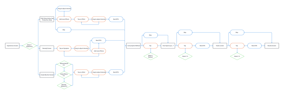
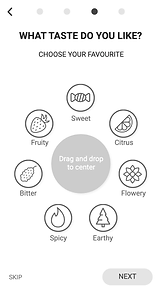
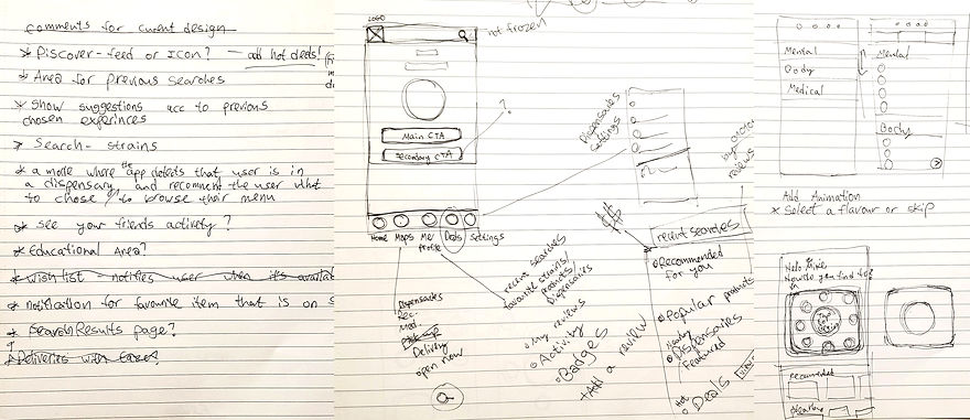
WIREFRAMES
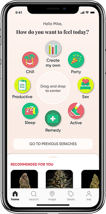
Facing much competition in the cannabis apps market, it was important for Canncopia to 'stand out from the crowd' and present a unique, innovative user interface. To offer a fun and interactive experience, similar to what users experience in games.
One of the challenges I was facing while designing this interface was making sure it will not come at the expense of the experience being intuitive and easy to use.
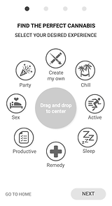
Research shows that the existence of icons in an interface may help users better perceive information. That is why I included icons in my design, assuming it could help cannabis consumers decide what they want to experience and how they want to feel.
In addition, I implemented in the wireframes a 'drag and drop' interactivity, which was later tested in a usability study.
USABILITY STUDY
The next step was to examine and observe how users interact with the new experience.
The twelve users who participated in the study were filmed while engaging with an interactive prototype (created with Axure), and later they were asked a few questions regarding their experience.
The main goals of the study were to discover and answer the following questions:
-
Is the user experience of the new design intuitive and easy to use?
-
Which parts of the new design are confusing and not ‘user-friendly’?
-
What do users like and dislike about the new experience?
In addition, we wanted to study the difference between the new version and the current version:
After we had let users experience both versions, we asked them which version they preferred.
The answer was clear,
10 out of 11 users preferred the new version
They indicated that the older version was confusing and complicated. It failed to provide them proper direction or guidance and they found it difficult to complete the task.
Even though most users preferred the new version, there were still further improvements to be made.
After reviewing and analyzing the study's findings, I was able to identify some usability and navigation problems.
_gif.gif)
Problem:
Not all users immediately understood they need to drag the icons to the center, they intuitively tapped on it and nothing happened.
Solution:
The interaction will be made both by tapping and by dragging.
Problem:
Some users were unfamiliar with different consumption methods.
Solution:
An information icon was added (i).
_gif.gif)
Problem:
Users didn't understand
that the icons can be dragged right and left to control intensity.
Solution:
Adding horizontal lines to indicate it is a slide bar.
In addition,
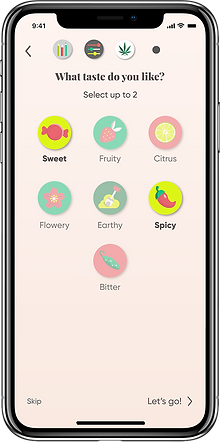
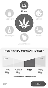
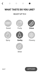
The order of screens was changed, to limit users to choose one consumption method, and up to two desired tastes.
ADDITIONAL FEATURES
After the main feature of the app (discussed in the above section) was designed, tested, and amended, it was time to work on other aspects of the app.
Two years after the app was first launched the cannabis industry was at its peak in California.
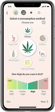
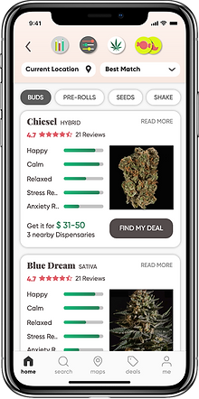
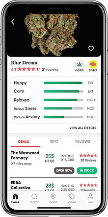
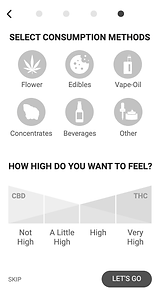
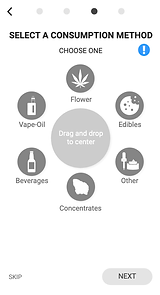
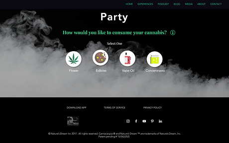
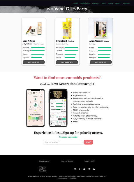
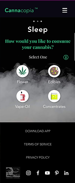
Cannacopia sought to upgrade the app and showcase not only cannabis flowers but also products such as Edibles, Vape-oils, Concentrates and more.
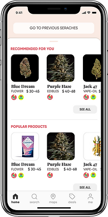
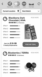
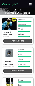
In addition, Cannacopia added a 'live inventory' feature, providing users with locations of stores in their vicinity in which the product is currently in stock.
The marketing team had handed me a customer profile report, which allowed me to study my target audience and understand which additional features and actions within the app could improve the user experience.
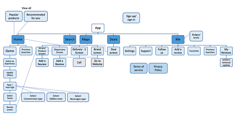
SITEMAP
UI MOCKUPS
I collaborated with the graphic designer on my team to bring the wireframes to life, by creating a style guide and designing icons.
WATCH THE PROTOTYPE
This is a screen recording showcasing the interactive prototype I created with Axure.
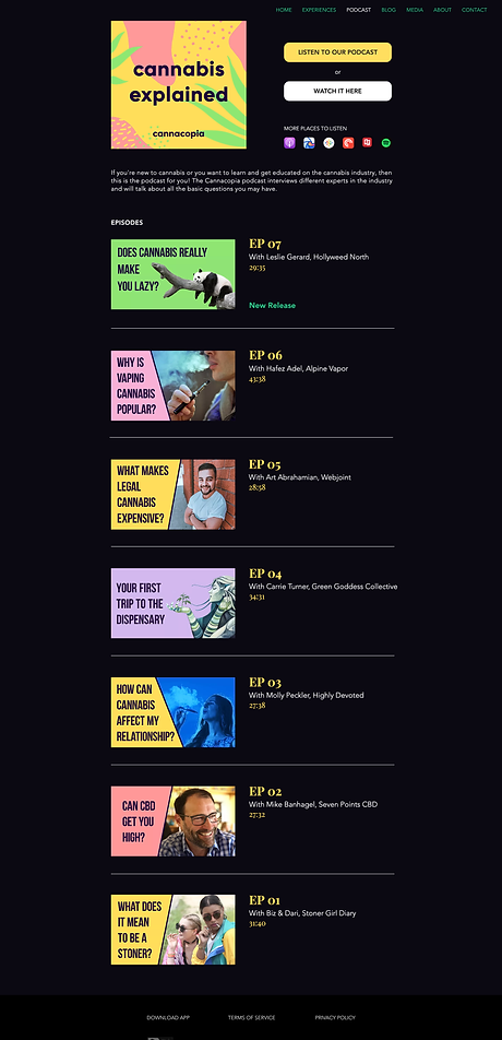
WEBSITE DESIGN
An additional task for which I was responsible was to redesign the promotional Cannacopia website.
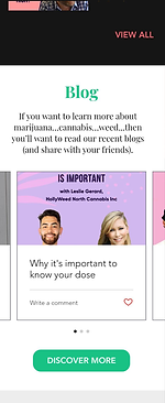
Because the new mobile app was under development, the website was designed to serve as a teaser, giving our users a sense of what will come. The website also showcases the Canncopia podcast, a blog, and media resources.
MOBILE

view more work
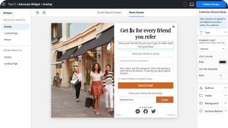
A Referral Program feature that empowers merchants to design referral widgets that can be integrated into their website.
Stay Tuned
